Get to Know: Compare Across Locations with Arable’s Advanced Analytics
Last week we dropped a new dashboard into the Advanced Analytics beta feature on Arable Web, Location Deep Dive. Well, we aren’t done yet! To build out the functionality of our Web & Mobile dashboards and continue to bring you some of the most flexible agronomic insights out there, today we are publishing the next installment: Compare Across Locations.
This new web dashboard has powerful visualization and analysis tools that allow you to easily compare water, weather, and plant measurements across multiple locations. With this kind of visibility, you can look at trends and averages to get a big-picture view of how things are developing across your organization; see how outcomes at multiple locations may be influenced by interlacing variables; and look at complex interactions to make new inroads in data analysis.
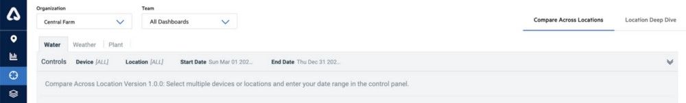
To access the dashboard, log in to Arable Web and click on the Advanced Analytics BETA section of the left-hand navigation bar. Look to the right and select Compare Across Locations. In the Controls panel, you can select which devices or locations you want to view (default selects all), and specify a date range. Now you can explore three tabs of insights: Water, Weather, and Plant. Read on for an overview of each of these tabs below!
Water
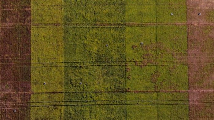
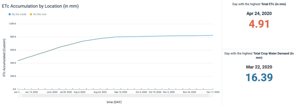
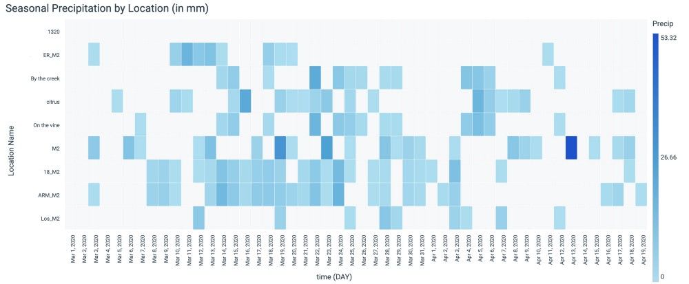
On this tab, you can track the movement of water through your sites via key water-related measurements. Precipitation is presented in daily events by location, and with a running cumulative total, so you can understand and compare rainfall amounts at different sites. Accumulated crop evapotranspiration, crop water demand, and top-depth soil moisture by location help you get a bigger-picture view of your plants’ role in the water cycle, and whether your irrigation strategy was sound. You can also view top-three locations and outlier days for many of these measurements to get a sense of variations throughout the season across your fields.
Weather
The collection of analyses on this tab lets you review trends and differences in microclimate at the selected locations. Look for outlier events which might have impacted your crop’s growth or skewed your averages during the season. Measurements here include location-based total & daily precipitation, heat stress days (above 97F/36C), vapor pressure deficit, and temperature extremes, plus a ranking of high/low days, locations, and metrics.
Plant
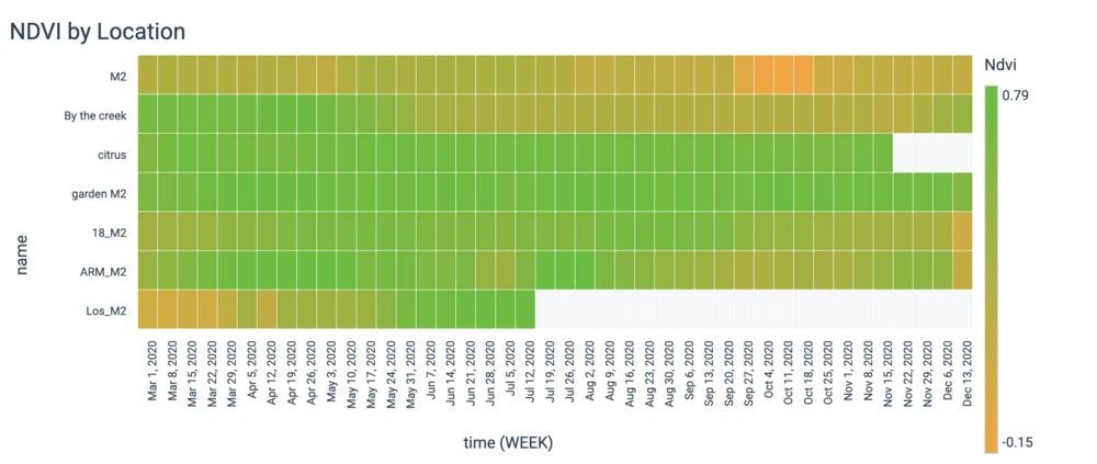
This tab focuses on how your crop responds to the events recorded on the Water & Weather tabs. You can chart growth at multiple locations to see their trajectories and uncover when, where, and how weather and climate influence growth and outcomes. The metrics on the Plant tab include location-specific NDVI, cumulative & daily growing degree days, chlorophyll index, sunshine duration & cumulative sunlight hours. To get a handle on how microclimate variables and management decisions affect your plants, you can also look at the locations and days with high/low values and accumulations, and see how they compare with averages.
New Analysis Tools
- Assess relative performance: Selecting only two deployments gives an instant snapshot of how one location is performing in relation to another. This comparison can inform your management choices, or pinpoint moments you want to investigate with the Location Deep Dive dashboard.
- Identify outliers: By selecting all of your deployments, or a particular subset of interest, you can compare data across many locations at a glance. This will help you to easily find outliers, and see when certain locations may have peaked, dipped, or plateaued compared with the group on key variables impacting crop development.
- Benchmark extremes: Sidebar insights ranking the top 3 locations for a given measurement can help you quickly understand which locations’ yield & quality outcomes may be driven by more extreme conditions.
- Know your averages: You can see a measurement’s average across selected locations to better understand microclimate and growth trends.
- Get the bigger picture: Rainfall and other variables summarized by week and month allow for easier assessment of seasonal patterns.
- Uncover complex interactions: Comparing ETc, Rainfall, and VPD in one chart reveals how the water cycle impacts yield and quality.
- Export and share: All visualizations can be easily exported to a spreadsheet and shared with other users.
On top of all of the new data and features we’ve released in the last month, we’re continuing to work with customers to develop new visualizations to help you do your job better.
At Arable, we believe that hearing from and responding to our customers is foundational to our success, and we’d love to hear your feedback and ideas for future features! Reach out to support@arable.com or contact your representative to start the conversation.
For more like this, visit the Arable blog.